The Edges of a Scene: Why Contrast Catches the Eye
Learn how contrast catches the eye around a room, so you can make useful objects easier to notice without adding more visual clutter.
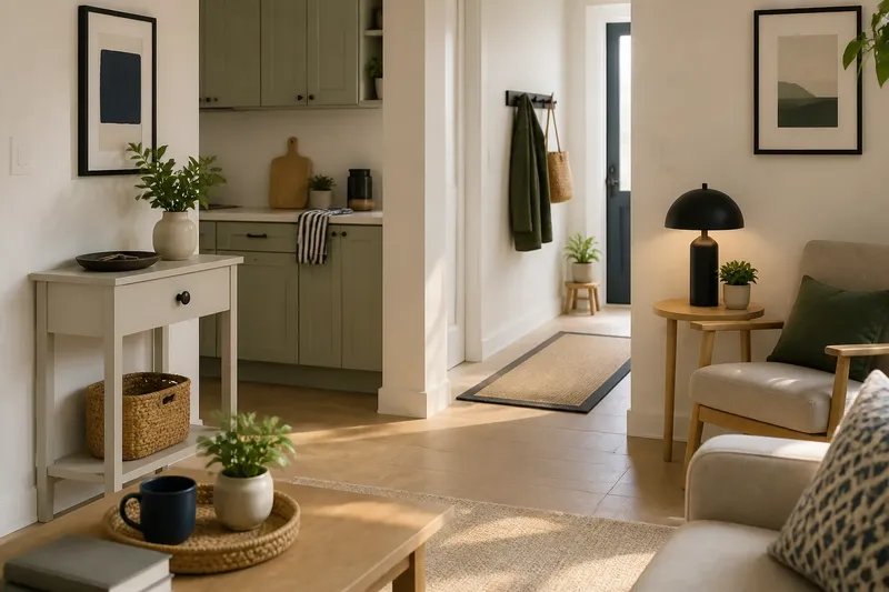
A dark handle on a pale cupboard catches the eye because its boundary is easy to detect. Contrast catches the eye wherever neighbouring tones or colours differ enough to make an edge stand out, from a mug on a counter to a doorway against a wall. The useful question is not simply what looks bold, but which boundary deserves attention in this particular room.
Read the boundary
Your visual system is especially responsive to change across a small area. A stretch of uninterrupted grey wall may recede from notice; the sharp line where a black frame meets it is easier to pick out. That line acts as a cue: it marks where one surface, object or opening ends and another begins.
Contrast can come from lightness, colour, texture or shape. A white label on a navy tin differs in tone; a woven basket against a smooth shelf differs in texture; a round knob on a rectangular drawer differs in shape. These cues can combine, but they need not. A clear tonal difference often works even when two objects share similar colours.
Think of an edge like the raised rim of a plate: it tells your hand where the surface changes. A visual boundary gives the eye a similar bit of structure, helping it separate an object from its background. If several strong edges compete, though, each has less claim to your attention.
Choose by room
Start with the room’s purpose and the way you use it. The same contrast that helps you spot a switch can make a calm corner feel visually busy. Sort the choice by situation rather than applying one colour rule everywhere.
For a busy entry
When you need to notice a particular object while leaving, give that object a distinct boundary against its immediate background. A bright key dish on a muted console may be easier to see than a bright dish surrounded by colourful post, bags and ornaments. Keep the contrast close to the item you want to locate, rather than spreading vivid accents across the whole area.
This suits a landing spot for keys, a reusable bag or a dog lead. If the object is usually hidden inside a drawer, a contrasting drawer pull can help identify the right drawer, but it will not make the contents visible. Match the cue to the part of the task where attention tends to stall.
For a shared kitchen
Choose contrast that clarifies a useful distinction without making every surface announce itself. A chopping board that differs from the worktop is easier to distinguish as an object; a contrasting tea towel near the oven can make that spot easier to pick out. Meanwhile, a row of brightly coloured jars may create more edges than the room needs.
Consider who uses the space and what must be recognised at a glance. If several people share cupboards, consistent handle or label contrast may help identify a group of items. If the aim is a quieter-looking counter, put the strongest difference on one necessary object and let less important items blend in.
For a reading corner
For a place to rest your eyes, lower contrast across the broad background and reserve stronger edges for practical details. A dark lamp base against a pale table can remain easy to locate without making the entire corner visually sharp. A patterned cushion, high-contrast rug and vivid artwork can each attract notice; together, they may pull attention in several directions.
This does not mean every restful room must be neutral. It means deciding where the strongest boundary belongs. Keep a favourite colourful object if it matters to you, then consider whether neighbouring patterns and accents need equal visual force.
For a narrow passage
In a hallway, doorway edges, coat hooks and items left on the floor all create boundaries. Use contrast to make a needed feature legible, such as a coat hook against the wall, while avoiding extra accents that make the route feel visually crowded. If an object is a hazard, removing or relocating it is more useful than making it conspicuous.
A dark mat on a pale floor can define the threshold, but a strong tonal change may also draw the eye towards the floor. Decide whether that is helpful for the room and its users. The visual effect depends on surrounding light, surface finish and the view from nearby rooms.
Set the contrast
Before buying paint or moving furniture, look at the object from the place where you need to notice it. Check it in daylight and in the room’s usual evening light: a boundary that seems clear at one time can become faint at another. Notice the immediate background, not only the object’s colour in isolation.
For a simple comparison, place a pale item on a pale shelf, then try it against a darker backing or beside a darker object. Step back to your normal viewing position. Ask whether the item becomes easier to distinguish and whether the new edge distracts from something more important.
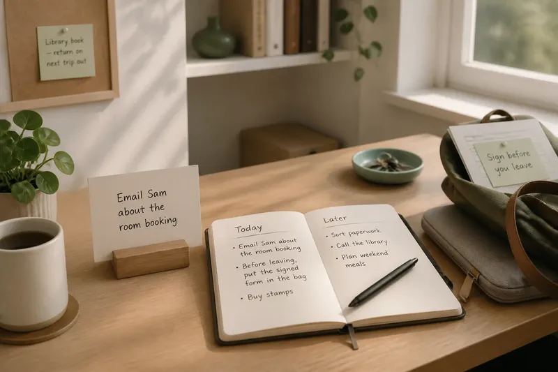
Say you keep a small notepad on a cream desk and often overlook it. Imagine placing it on a dark blue tray while leaving the other desk items where they are. The expected observable result is a clearer outline around the notepad from the chair; if the tray becomes the first thing you notice instead, try a smaller or less saturated backing.
For a more controlled adjustment, change one thing at a time: the object’s position, its backing, or the nearby colour. If you change several surfaces at once, it becomes harder to tell which boundary helped. You are not aiming for the strongest possible contrast, but enough difference for the intended object to separate from its surroundings.
- Check the viewing position: Look from the doorway, chair or work surface where the object must be noticed; move it if its outline is hidden from that angle.
- Check the background: Compare the object with the surface directly behind it; choose a different backing if similar tones cause the edge to disappear.
- Check competing edges: Scan nearby patterns, handles and decorations; simplify or relocate an unnecessary accent if it draws attention first.
- Check changing light: View the area in the light you commonly use; consider another location or a more dependable tonal difference if the boundary fades.
- Check the object’s importance: Ask whether it needs to stand out at all; let low-priority items blend into the background where that suits the room.
When does contrast help?
Does bright colour always attract attention?
No. Brightness can stand out, but a muted object against a very different tone may be easier to distinguish than a vivid object among similar colours. Look at the boundary and its surroundings rather than judging the object alone.
Should every useful object contrast?
No. Give a clear edge to objects you need to locate quickly, and let other items sit more quietly. If every object is a visual landmark, none has much advantage over the rest.
Can texture create contrast?
Yes. A rough basket against smooth cabinetry or a ribbed pot on a plain shelf may stand out through surface difference, even when their colours are close. Check the view from the relevant position, since fine texture may be hard to distinguish at a distance.
What if a boundary disappears at night?
First check whether the room’s existing light reaches the object and its background. You might move the item to a more visible surface or use a stronger difference in tone; do not assume colour alone will remain clear under every lamp.
Keep cues selective
A room can guide attention without looking like a collection of signs. Reserve pronounced contrast for a few meaningful boundaries, then allow broad surfaces and less-used objects to remain visually calm. This makes each chosen cue easier to interpret and gives the eye fewer competing edges to sort through.
Use the room as it is actually used: notice what disappears from view, which surfaces sit behind it and where you stand when you need to find it. A small change to a nearby background may be enough. The best contrast catches the eye at the right boundary, then lets attention return to the rest of the room.